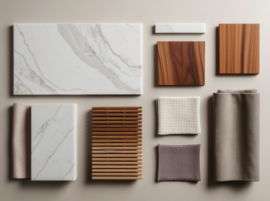
Colour is the cheapest renovation you can do. A coat of paint or a change of cabinet finish does not require a contractor, a permit, or weeks of dust. And in a small Malaysian kitchen — where knocking down walls is rarely an option — the right colour choice can visually double the sense of space without touching the floor plan.
This guide breaks down exactly which colours work, why they work, how to combine them correctly for Malaysian kitchens, and which combinations to avoid. Whether you are planning a full renovation or just reconsidering your next cabinet order, colour is the decision that will affect how your kitchen feels every single day. For the full picture on designing a compact kitchen, see our small kitchen interior design guide.
- Light, cool-toned neutrals — soft white, pale grey, greige — are the most effective colours for making a small Malaysian kitchen look bigger because they reflect light and eliminate visual boundaries.
- High-gloss finishes on light-coloured cabinets amplify the space-expanding effect by bouncing light around the room — especially important in Malaysian kitchens where natural light is often limited.
- Using the same colour tone on cabinets, walls, and backsplash (a monochromatic approach) removes the visual breaks that make a small kitchen feel chopped up and contained.
- Two-tone cabinet combinations — lighter uppers, slightly deeper lowers — are a practical middle ground that adds visual interest without making the space feel smaller.
- Dark colours are not automatically wrong in small kitchens — they require strong lighting and strategic placement to work, but can add depth and character when used correctly.
- Warm accent tones in hardware, handles, and accessories can add personality to a light-coloured kitchen without affecting the spatial perception that the base colour creates.
Why Does Colour Affect How Big a Kitchen Feels?
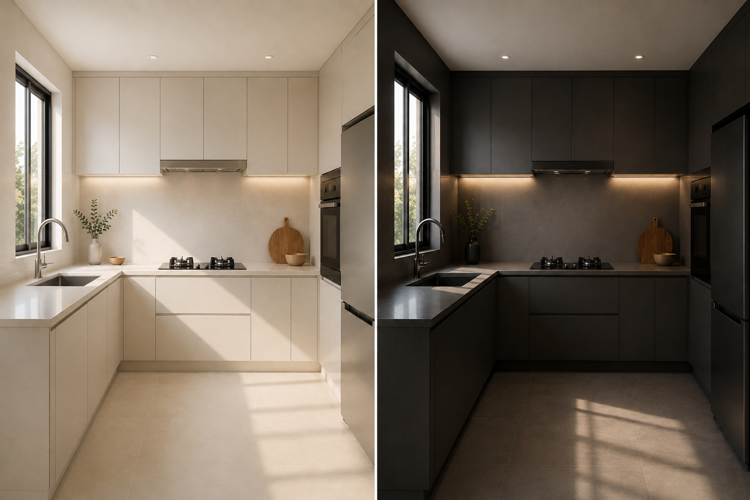
Colour affects spatial perception because light colours reflect more light — making surfaces appear to recede and the space feel more open — while dark colours absorb light, making surfaces advance toward the eye and the room feel more enclosed. In a small kitchen, where walls, ceiling, cabinets, and countertops are all within close visual range of each other, colour has a disproportionately large effect on how spacious the room feels.
The science behind this is straightforward: light-coloured surfaces reflect up to 80% of the light that hits them, while dark surfaces may reflect as little as 5%. In a small kitchen where every surface is within arm's reach of the next, this difference in reflectivity translates directly into a perceived difference in room size.
In Malaysian homes — where kitchens in condos and terrace houses often have one small window or no window at all — this effect is even more pronounced. A dark-coloured kitchen with limited natural light will feel significantly smaller than the same space painted white with good artificial lighting. This is why colour is one of the first recommendations any experienced kitchen designer will make to a homeowner with a compact kitchen.
The Best Colours That Make a Small Kitchen Look Bigger
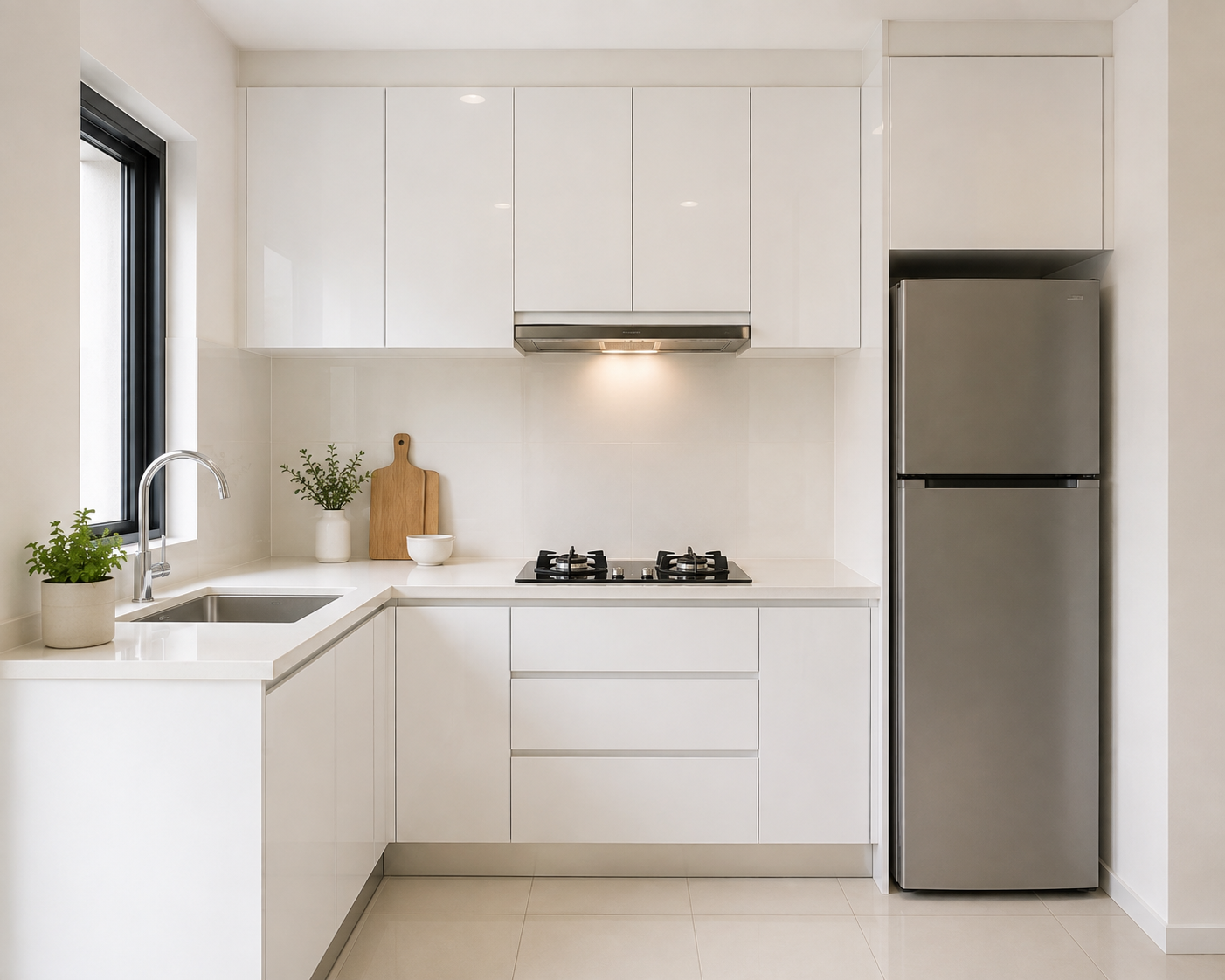
Soft white is the single most effective colour for making a small kitchen feel larger — and it has been for decades, not because of trend cycles but because of physics. White reflects the most light of any colour, eliminates the visual boundaries between surfaces, and creates a seamless, continuous appearance that the eye reads as spacious.
The key distinction is between stark white (pure #FFFFFF) and soft white. Pure white in a Malaysian kitchen with warm-toned lighting can appear cold, clinical, and harsh. Soft white — with the slightest warm or neutral undertone — reads as clean and open without the sterility. It also shows fingerprints and cooking residue more readily, which is worth factoring into the finish choice: gloss is easier to wipe clean, matte hides fingerprints better but shows grease more over time.
For most Malaysian kitchens, soft white cabinets with a gloss or semi-gloss finish remain the safest and most consistently effective choice for creating a sense of space. Browse our completed kitchen projects to see white cabinet kitchens in real Malaysian homes.
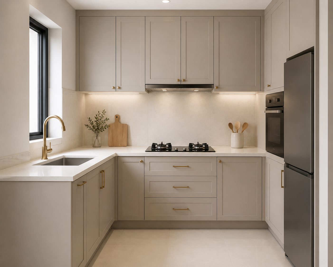
Greige — the blend of grey and beige — has become one of the most popular kitchen cabinet colours in Malaysian homes in 2025 and 2026 for good reason. It carries the spatial benefits of a neutral tone (reflects light, visually recedes) while adding warmth that pure grey and white cannot. The result is a kitchen that feels open and airy but also liveable and warm — important in a space where you spend significant time every day.
Greige works especially well in Malaysian kitchens where the flooring is a warm-toned timber or natural stone — the undertone of the greige bridges the gap between the floor and upper surfaces without the jarring contrast of a cool white against warm timber. It also ages well: greige hides minor marks and discolouration better than pure white while staying light enough to maintain the spatial effect. See our top kitchen cabinet designs guide for real greige and warm neutral examples.
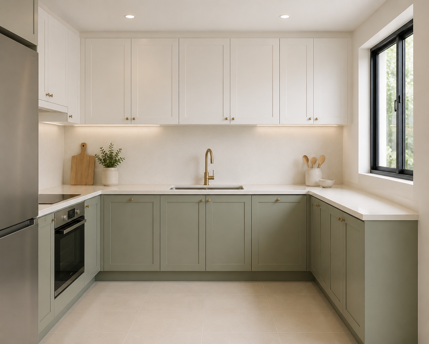
Pale sage green is the most interesting colour on this list — it adds genuine personality and a hint of nature without the risk of making a small kitchen feel smaller. The key is that pale sage sits in the mid-tone range with strong grey undertones, which means it reads as a neutral in most lighting conditions rather than as a bold colour statement.
In Malaysian kitchens, pale sage works particularly well in homes with plants, natural materials, or a Japandi or Scandinavian aesthetic. It brings the outdoors in without the visual weight of a stronger green. It also pairs naturally with the raw timber and concrete tones that are popular in contemporary Malaysian interior design.
One important consideration: pale sage green is very sensitive to lighting. Under warm yellow lighting it can look muddy or grey-brown; under neutral or daylight lighting it reads as the soft, sophisticated green it is. Always view colour samples under your actual kitchen lighting before committing. Qanvast Malaysia has a strong gallery of sage and nature-toned kitchens in local homes for further inspiration.
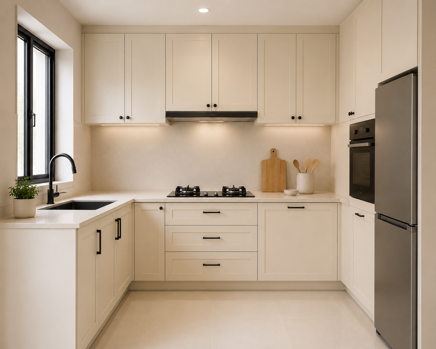
Cream is white's warmer cousin — and for Malaysian kitchens where the overall interior palette leans warm (timber floors, warm-toned walls, brass fixtures), cream is often the better choice than soft white. It provides the same light-reflecting, space-expanding effect but in a tone that harmonises with warm interiors rather than creating the cool clinical contrast that white sometimes generates.
Cream cabinets pair particularly well with darker hardware — matte black handles or brushed brass — which provides enough contrast to define the cabinet fronts clearly without competing with the light base colour. This combination has been popular in the "Creamy Style" aesthetic that has a strong following among Malaysian homeowners in 2025 and 2026.
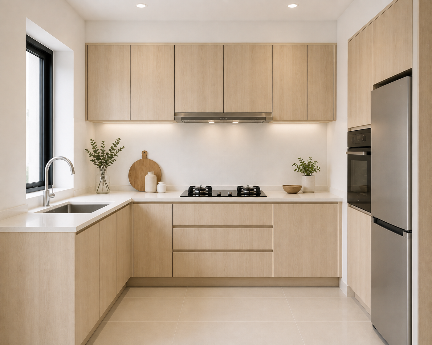
A light oak or blonde timber finish adds natural warmth and texture that solid colours cannot replicate — and in a small kitchen, the grain of the wood creates visual interest that distracts from the smallness of the space rather than drawing attention to it. Light oak specifically reads as airy and Scandinavian rather than heavy and traditional, making it suitable for compact Malaysian kitchens that want warmth without visual weight.
The important word here is light. Dark walnut, deep mahogany, and heavily grained medium timbers make small kitchens feel heavier and more enclosed. Light oak, blonde oak, and whitewashed or light-stained timber finishes maintain the reflective, open quality needed in compact spaces. For Malaysian condo kitchens where the aesthetic tends toward contemporary minimalism, a light oak laminate on cabinets alongside white walls is one of the most consistently well-executed combinations. The IKEA Malaysia kitchen gallery has useful visual references for light timber and white combinations.
Two-Tone Colour Combinations That Work in Small Kitchens
A single colour throughout the kitchen is the safest approach for maximum spatial effect — but it is not the only one. Two-tone cabinet combinations, when done correctly, can add visual interest and personality to a small kitchen without reducing the sense of space. The key is the direction of contrast and how much tonal difference exists between the two colours. For the full list of cabinet design decisions worth making before fabrication, see our guide on cabinet features Malaysians regret not adding.
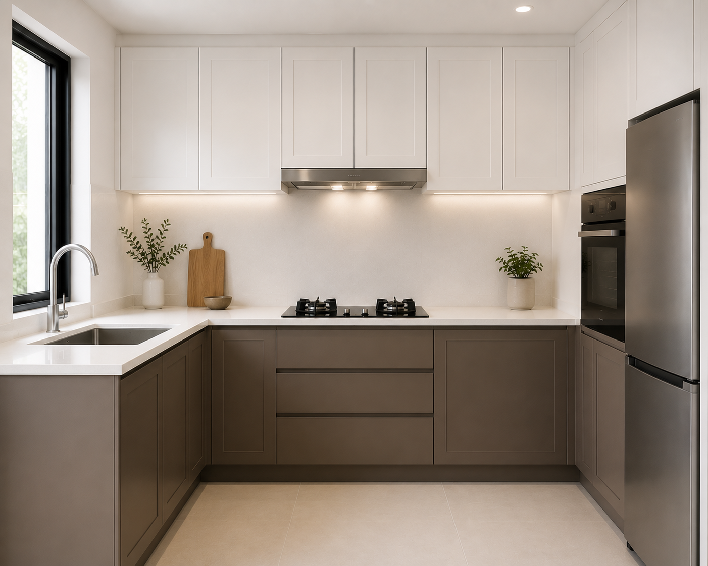
- White Uppers + Light Grey or Greige Lowers — Most Popular The most widely used two-tone combination in Malaysian kitchens. Light upper cabinets maintain the open, airy ceiling-level feel while slightly deeper lower cabinets add groundedness and hide marks from daily cooking at floor level. The tonal difference is small enough that the room reads as continuous rather than divided.
- Cream Uppers + Warm Timber Lowers — Creamy Style Cream upper cabinets with light oak or blonde timber lower cabinets is the defining look of the "Creamy Style" popular among Malaysian homeowners in 2025 and 2026. Both tones are warm, both are light — they create a layered warmth rather than a stark contrast. Works best when walls are kept in a warm white or ivory to maintain visual continuity.
- White Uppers + Sage or Muted Green Lowers — Fresh & Modern Keeping upper cabinets white while introducing a soft sage, dusty blue, or muted green on lower cabinets adds a colour accent without affecting the light-reflective ceiling level. The eye reads the bright upper section first, which establishes the sense of openness, and the colour sits below the sightline where it reads as a grounded accent rather than a dominant tone.
- What to Avoid in Two-Tone Combinations Avoid strong contrast two-tone combinations — bright white with very dark grey, or light uppers with deep navy or charcoal lowers — in small kitchens. The strong visual break at the countertop line divides the kitchen into two distinct sections, making each one feel smaller than the whole. Reserve high-contrast two-tone for larger kitchens where the contrast reads as deliberate rather than space-reducing.
Gloss vs Matte: Which Finish Makes a Small Kitchen Look Bigger?
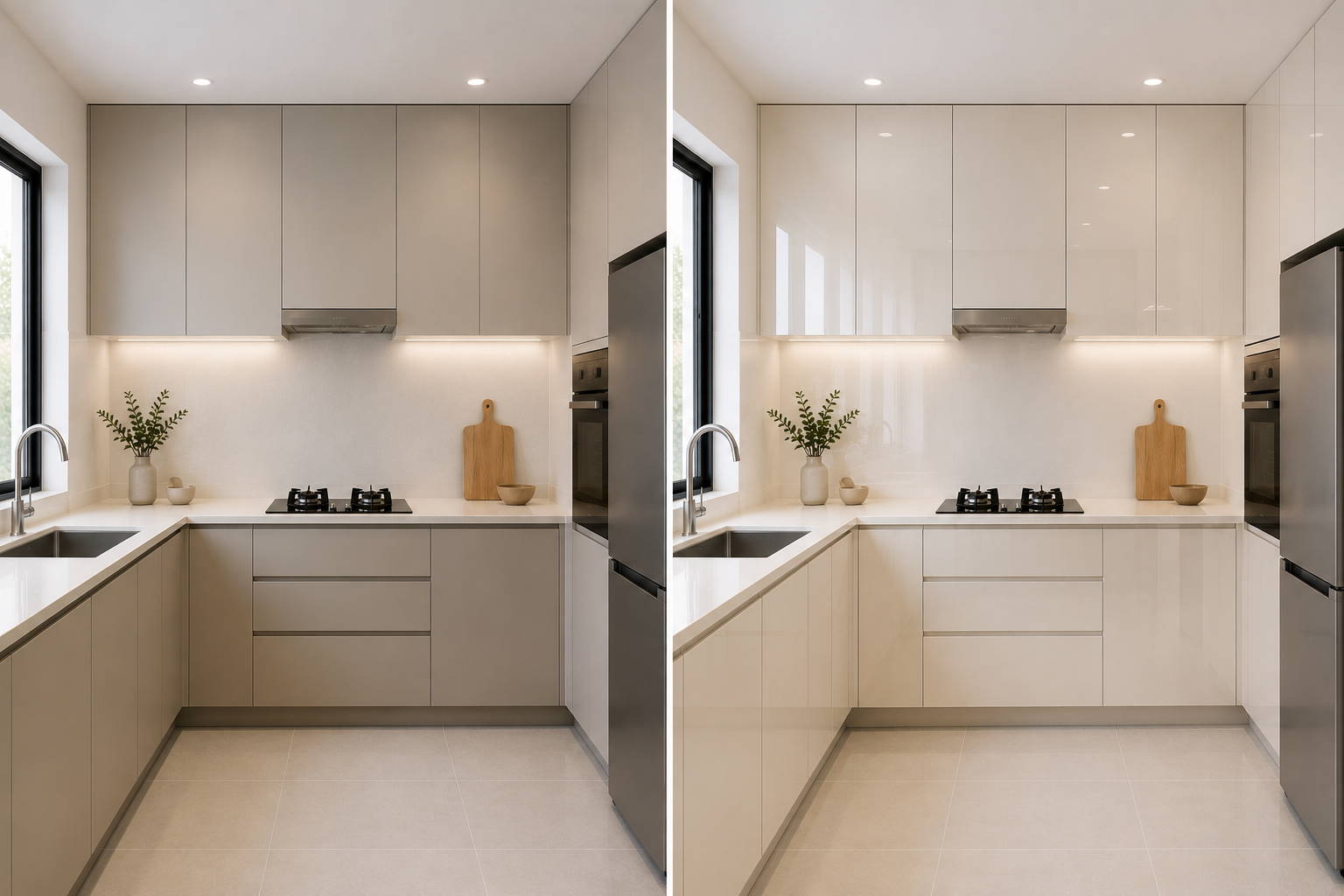
High-gloss finishes make small kitchens look bigger because they reflect light — adding an additional layer of luminosity on top of the colour's natural light-reflective properties. In a small Malaysian kitchen with limited natural light, gloss cabinets in a light colour are the most effective combination for maximising the sense of space. Matte finishes create a more contained, intimate feel and are better suited to larger kitchens where space is not the primary concern.
- Reflects light — makes the room feel brighter and larger
- Easy to wipe clean — grease and splashes come off easily
- Creates a seamless, premium appearance
- Amplifies the space-expanding effect of light colours
- Popular for Malaysian dry kitchens facing the living area
- Absorbs light — makes small spaces feel more contained
- Shows fingerprints and smudges more visibly on dark tones
- More difficult to clean grease spots completely
- Creates a softer, cosier feel — suitable when space is not a concern
- Works better in kitchens with strong artificial lighting
Colours and Combinations to Avoid in Small Kitchens
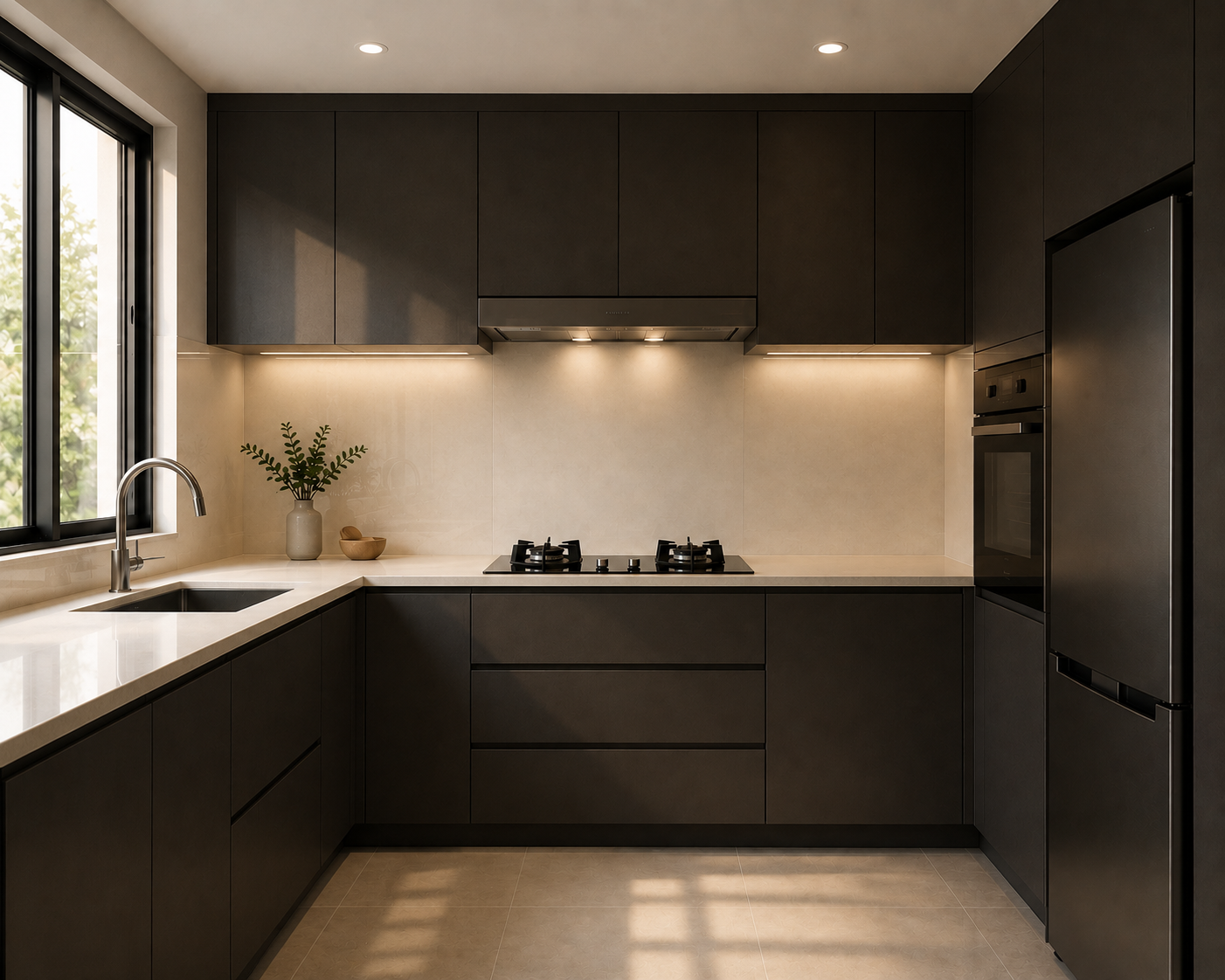
- Dark cabinets on all surfaces without strong lighting — deep navy, charcoal, black, and dark walnut absorb light and make every surface advance toward the eye. In a small kitchen with a single overhead light and limited natural light, this combination will consistently make the space feel significantly smaller than it is.
- Strong contrast between cabinets, walls, and ceiling — when the cabinet colour, wall colour, and ceiling are all visibly different tones, the eye registers multiple distinct boundaries within a small space. Each boundary reduces the perceived room size. Minimising tonal contrast between surfaces — even if the colours are not identical — maintains visual flow.
- Busy or heavily patterned cabinet finishes — heavily grained dark timber, bold geometric patterns on cabinet fronts, and multi-colour finishes add visual noise that makes a small kitchen feel cluttered before a single item is placed on the counter. Reserve pattern for a single surface — a backsplash or feature tile — and keep cabinets in a clean, solid tone.
- Warm yellow-toned lighting with cool-toned cabinets — warm incandescent lighting makes cool grey and white cabinets look slightly yellow-grey, which can make the kitchen feel dated and duller than it should. Match lighting colour temperature to cabinet tone: warm white (3000K) for cream and warm whites, neutral white (4000K) for cool whites and greys. Our kitchen renovation checklist includes a lighting planning section to help you get this right before work begins.
- Different cabinet colours on the same wall — mixing multiple cabinet colours across a single continuous run (unless deliberately planned as a two-tone) fragments the visual continuity and makes the kitchen feel smaller. Colour transitions should happen at natural breaking points — a corner, a window, or a change in cabinet function.
How Wall, Backsplash, and Ceiling Colour Affects Small Kitchen Size
Cabinet colour gets the most attention in kitchen design — but the walls, backsplash, and ceiling all contribute to the overall spatial perception. Getting these right multiplies the effect of your cabinet colour choice.
- Walls — Keep Close to Cabinet Tone The wall areas visible above and between kitchen cabinets should be in the same colour family as the cabinets — or lighter. A strong contrast between cabinet colour and wall colour creates a visual frame around the cabinets that makes the room feel more enclosed. Match the wall to the cabinet tone within one or two shades for the most seamless, spacious result. For white cabinets, a warm white or off-white wall works better than stark pure white which can appear harsh.
- Backsplash — Use Large Format, Minimal Grout Lines The backsplash is the one surface where you have the most flexibility to add texture or subtle pattern without affecting spatial perception — provided the base tone remains light. Large-format tiles (600mm × 300mm or larger) with thin grout lines extend the visual surface without interruption. Small mosaic tiles with thick grout lines create visual noise that closes the space in. A backsplash in the same tone as the cabinet is the most seamless choice; a subtle contrasting texture in the same light colour family adds depth without visual weight.
- Ceiling — Always Keep Light The ceiling is the one surface where dark colour almost never works in a small kitchen. A dark ceiling visually lowers the height of the room and makes the space feel enclosed regardless of how light the other surfaces are. Keep the ceiling in the lightest available tone — pure white or very light off-white. If cabinets extend to ceiling height (the most space-efficient option), the ceiling-to-cabinet junction becomes seamless and the perceived height of the room is significantly greater. See our compact kitchen storage guide for more strategies that work alongside your colour choice.
- Flooring — Lighter is Better, Larger Format is Better Light-coloured flooring in a large format (600mm × 600mm or larger) makes the floor plane recede and the kitchen feel more expansive. Dark flooring can ground a room beautifully in larger spaces but tends to make small kitchens feel heavy and contained. If you already have dark flooring and cannot change it, compensate with maximally light walls and cabinets to balance the overall lightness of the space.
Colour Quick Reference — Small Malaysian Kitchen Guide
| Colour | Spatial Effect | Best Finish | Best Paired With | Verdict |
|---|---|---|---|---|
| Soft White | Maximum space expansion | Gloss or semi-gloss | Light grey countertop, gold hardware | ✓ Best for small kitchens |
| Greige | Open + warm | Gloss or semi-gloss | Warm white walls, brass hardware | ✓ Highly recommended |
| Pale Sage Green | Open + fresh character | Matte or semi-gloss | White walls, timber accents | ✓ Good with strong lighting |
| Cream | Warm + open | Gloss or semi-gloss | Warm walls, black or gold hardware | ✓ Great for warm interiors |
| Light Oak | Natural + airy | Satin or natural finish | White walls, matte black hardware | ✓ Good for Scandi/Japandi styles |
| Medium Grey | Neutral — use carefully | Semi-gloss | White uppers only (two-tone) | ⚠ Lower cabinets only |
| Dusty Blue / Sage | Adds colour — light tones only | Matte or satin | White uppers, strong lighting | ⚠ Lower cabinets only |
| Dark Charcoal / Navy | Reduces space significantly | Any | Requires very strong lighting | ✕ Avoid in small kitchens |
| Dark Walnut / Deep Brown | Heavy, enclosed feel | Any | Not recommended for small spaces | ✕ Avoid in small kitchens |
Choosing Cabinet Colours for Your Kitchen?
Visit our showrooms in PJ, Subang Jaya, or Kajang to see real colour and finish samples under actual showroom lighting — the only way to see how a colour will truly look in your kitchen before you commit.
Chat With Our Design TeamFrequently Asked Questions
What colour makes a small kitchen look bigger?
Light, neutral colours — particularly soft white, off-white, pale grey, and cream — are the most effective at making a small kitchen look bigger. These colours reflect natural and artificial light, making the space feel more open and airy. In Malaysian kitchens where natural light is often limited, high-gloss finishes on light-coloured cabinets amplify this effect further by bouncing light around the room.
Should I use the same colour on cabinets and walls in a small kitchen?
Yes — using the same or very similar colour tone on both cabinets and walls is one of the most effective ways to make a small kitchen feel larger. Contrasting cabinet and wall colours create visible breaks that chop the room into smaller visual sections. A single continuous tone makes the eye travel further across the room without interruption, creating a perception of more space.
What cabinet colours are popular for small Malaysian kitchens in 2026?
The most popular cabinet colours for small Malaysian kitchens in 2026 are soft white, greige (grey-beige), pale sage green, cream, and light oak. These are all light to mid-tone colours that reflect light, suit Malaysia's tropical climate, and work with a range of interior styles. Two-tone combinations — lighter uppers with slightly deeper lowers — are also growing in popularity for adding visual interest without making the space feel smaller.
Do dark colours always make a small kitchen look smaller?
Not always — but they require specific conditions to work. Dark colours on all surfaces in a poorly lit space will make the kitchen feel smaller. However, dark colours used on a single lower cabinet run while upper cabinets stay white, or as a feature wall with strong lighting, can add depth without reducing the sense of space. The key is contrast and lighting: dark colours need strong ambient and task lighting to work in compact kitchens.
Does cabinet finish (matte vs gloss) affect how big a small kitchen looks?
Yes — significantly. High-gloss cabinet finishes reflect light and make a small kitchen feel brighter and more spacious. Matte finishes absorb light and create a more contained, cosy feel. In a small Malaysian kitchen with limited natural light, gloss or semi-gloss finishes on light-coloured cabinets are the most effective way to maximise the sense of space. If you prefer matte, use it on lower cabinets only and keep upper cabinets in a gloss finish to maintain the light-reflective ceiling zone.
What backsplash colour makes a small kitchen look bigger?
For small kitchens, a backsplash in the same colour family as the cabinets — or a light, neutral tone — avoids breaking the visual continuity of the space. Large-format tiles with minimal grout lines extend the sense of space. Glass or mirrored backsplash tiles reflect light and visually push the wall back. Busy patterns or strongly contrasting backsplash tiles can make a small kitchen feel more cluttered and contained.